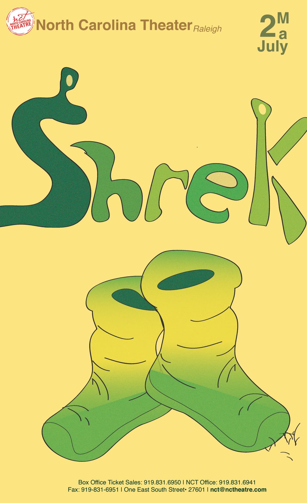
Thursday, February 24, 2011

CD inspiration


The cd can look like or relate to the cover of its case. This is only successful when the design fits the cd corresponding to its circular form.


Think about how everything is going to look when the whole design is put together. Will the cd look together when it is placed where it in its case?


Think about the colors and how you can create the same flow from the cover to the cd.


Think about how the information is displayed.

Audio Book Jacket inspiration


Dont be afraid to experiment with layers and don't forget about type. Make sure what needs to stand out stands out and that your concept carries to where it need to carry.


Keep in mind the story that is being told. Make sure everything balances. It is ok to use photograph but make sure you make them original.


Dont be afraid to experiment with texture. Be creative and don't be afraid of the crazy ideas that pop up in your head. The ideas you formulate may be the right ones that are successful.


Every little detail is important. It is a no no to just place objects. Take a look at this design. The barcode was even designed to symbolize the theme.

My Book Jacket assignment


SKETCHES
The assignment I did was to create a book jacket. This is the front cover, the spine, and the back of a book. I had to create three sketches of the book "a good man is hard to find" my concept that I choose for it was irony. Somehow I had to create the feel of irony in my design so I played around with different things that I read about in the book. In doing these three sketches I saw little things that I liked and that could be used in my book jacket.


FINAL BOOK JACKET
This is the final book jacket. I basically played with type and space. I feel like this was the best i have did since my previous projects. It has great composition It really tells the story without giving everything away and it holds the characters I wanted it to display. The only thing I feel that I would change is to shift the "A" on the spine a little over. This project just made me realize that I can do anything that I can put my mind to!

Friday, February 11, 2011

Inspirations


If it was not for God. I would not have the talent I needed to get this far in my Graphic Design classes. Im So GRATEFUL! Thank You God :)


Things to consider would be placement and the concept of the problem your given. To solve the problem of making a book cover the first thing to do is research...know what the book is about. Then consider what you want to do? Think of questions like would you want to include pictures? What typeface would be understandable to use in your situation? Are things going to make since whent you begin to solve your problem?


Consider how you want people to read your solution. Dont be afraid to consider your negative space as an iteresting consept to your design. Play with the dominance of the objects you deside to create and put in your design. Dont be afraid of placement. Maybe your client wants your to incorprete diaganal text and all they give you is a title to the book their created and a breif summary. How would you aproach that problem?


In some situations it may be ok with the overlaping of an image and your title. Just consider which is more important. Sometimes the object could be the main story and the text could just be a solution to pushing along why the image stands out frome everything.

Research and Ideas for bookcover


For project II in graphic design class I have to make a bookcover for this book. This is the orignal cover. At first the title made me think the obvious book the book is really ironic. The books main character is the grandma, hince the woman on the front cover. The hat she wears represents her misconsumptions. The peacock feathers represent men and their attractions.


This was just another idea of how to approach a look for the book. The book is about a family going to virginia for vacation. The grandmother doesnt want to go to virginia she wants to go to tennessee because there was a man loose in virigina. The man was considered a misfit in the book. The grandmother son did not consider the possibilities of crossing the jail breaks path in virginia so he disregarded his grandma. The grandmother's son his wife, his two kids and his wife and the baby were blind in seeing the actual misfit that the police where looking for was the one they ended up getting killed by and the grandma was the last to die. They were killed by a gun. Which was ironic because the misfit said to the grandma he would never kill a woman by a gun.

Thursday, February 3, 2011

MY GRAPHIC DESIGN work


IN PROGRESS...
This is my in progress design. In Graphic DesignII I had to create a theatrical poster using a famous movie that already exist. I decided to create my theatrical poster off of the movie "Shrek." It is a family movie that has so many resources that could be played with. The idea was to create a feel of the environment that the play or movie would be held and capture what the story is about. This design was the first approach I took to assignment. In progress It was not meeting expectations. Although it was not solving the main goals that needed to be achieved it has some nice qualities to it.


FINISHED ASSIGNMENT...
Does it meet expectations? This graphic design no longer has a foreign fill to the region that it would be exposed to. The placement is nice and the things that I thought had potential in this piece from the "in progress" really stands out. Although I think it needs a little more work I think this really turned out ok compared to the disasters i went through in building it through illustrator.


IN PROGRESS1...
This was my first approach to my lampshade assignment in typography class. I liked it but I was told that I was shy with type. For the project I had use one typeface family and design a quote of my choice. The design had to be expressive to the quote.


IN PROGRESS2...
Still in progress I decided to explore a little more of what I can do. This is what I got. I somehow created a playful theme to a serious quote. I had to go back and dull down a lot of things to meet the criteria of the assignment which is to effective express visually with only one typeface family the seriousness of my quote. "Things became a little aggravating"


FINISHED ASSIGNMENT...
This is my final result to my first project in typography. I felt almost satisfied with the expression of seriousness I finally conquered with the quote itself. Although classmates visualized everything wrong with it I felt like I came a long way from taking a quote, giving a visual expression related to the quote using one typeface family and the quote itself of course, and planning visually the three dimensionality of the whole design and its purpose.