Friday, April 29, 2011
My Progress on Poster & DVD Design
Pictures I have taken and manipulated through the processes of making my poster and DvD design. It is great to experiment because you never know what you come up with.
A woman and a man's back are different. A mans back is wide and has a different feel than a woman's back. I took a couple of photographs of peoples backs around my campus and these two came to be the best for my brochure. Playing around with photoshop trying to create a scared look I came across using the idea of using a tree to create the feeling of pain for my suicide prevention products.
This is the picture I took of a tree near my dorm. It gave me a rough human like feel giving me the idea to combine the photos of the human backs and the tree to give the seriousness of suicidal feel.
It is amazing what ideas you can create in photoshop!
After messing in photoshop I ended up bringing the images to illustrator.
Taking each image into illustrator I started playing around with placement and text. It is going to be type heavy so I still have a long way to go.
This was just an Idea...The finished is yet to be coming soon when I finish it. I hope you enjoyed the sneak of the idea so far.
I finally finished the poster and DVD cover.
I enjoyed working on this project. I hope you all enjoy looking at the progress.
Friday, April 15, 2011
DVD and Poster Ideas (typography)
My DVD and Poster design project is on American foundation for suicide prevention documentary. I want to have a very provocative background...In this I want the audience to portray a uncomfortable feeling about the situation of knowing there are suicidal people out there and that they are influenced to be this way. That they can be influenced to turn away from the their wanting to commit suicide.
A little something I illustrated
I illustrated a greeting/easter card to donate for P.A.W.S organization to auction. I took my graphic design skills and recreated it in Illustrator CS5. I wanted it to have an Old character look to it so I played around with some of the design elements and gave it soft but highly saturated colors to see how it would turn out. To me it came out pretty good and I am very happy about it. I was very proud to have done came up with a quick illustration and apply my graphic skills. It only took a day to accomplish this :)
My Brochure Project Design
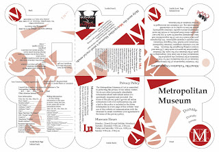
My project was to design a Brochure with the three postcard design that I created for the Metropolitan Museum (the assigned place I got for my project). The brochure when folded comes out to be 6" x 6". I wanted to base the brochure off of the Metro museum logo. I designed it to be viewed in an accordion fold. The only thing that I find need two be re-evaluated is the front of my brochure. In critique I found that the word "donate" was being placed to many times and made the viewers (my classmates) feel like the company may have been desperate.
My Brochure Folded!
My Product Redesign
This is my product redesign. I redesign the Lance cheddar cheese whole grain crackers to make it more kid friendly. I think that my overall design came out pretty good. The only thing is that the little wheat cracker dude doesn't stand out as much as it should.
Taking pictures of my final product was pretty difficult. I did not have a good lighting when taking photographs of the printed and wrapped product.
In each photo you can see some of the things that I did fairly clearly. These photos are to help see how the product redesign looked in the round around the actual product.
I edited some things and this is my newest design of my product redesign.
Sunday, March 27, 2011
Graphic Design II: Label/Package redesign: Before and After
A great Inspiration and find on getting to know the new changes in the marketing design industry!
Graphic Design II: Label/Package redesign: Before and After: "Click here to go to 'thedieline.com' and review great cases of label and package redesign. ."
Graphic Design II: Label/Package redesign: Before and After: "Click here to go to 'thedieline.com' and review great cases of label and package redesign. ."
My Label Redesign project Research
I chose to redesign Lance whole grain cheddar cheese crackers.
This is the product I am redesigning. For as long as I know the product design has been the same. It was basically designed for moms to place in children lunch boxes for school. I plan on making it more modern and making it more eye catching for moms.
Here is a link that show lance product and ingredients.
http://www.lance.com/products/sandwich-crackers/cheese-whole-grain
Lets take it back...This is the first lance cracker. It first came out in the 1915's.
1954 — The first Lance vending machine.
Here are some pictures I took at walmart to show the location of the product I'm redesigning and its competitors:
Subscribe to:
Comments (Atom)


